Option 2: Mobile Application
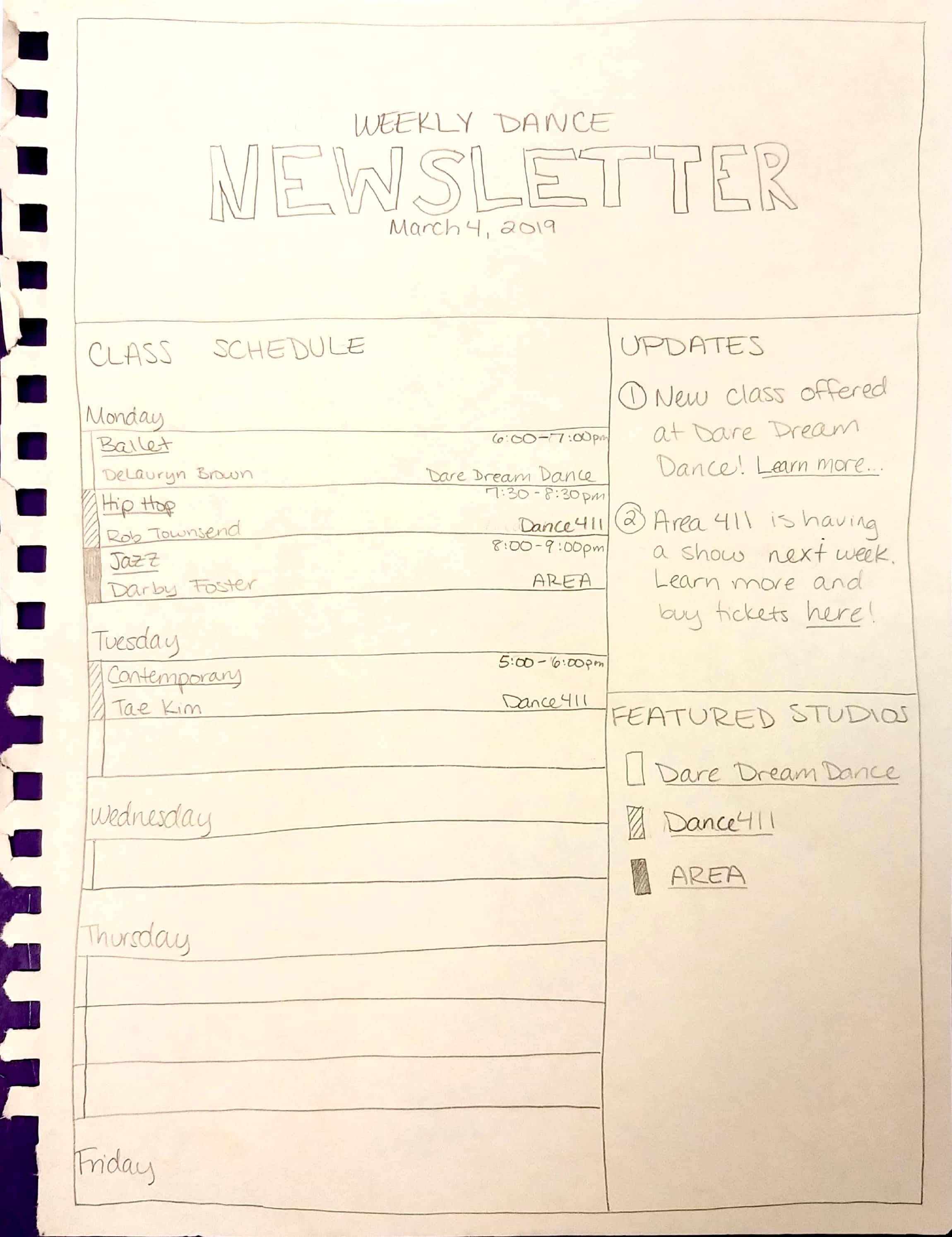
Option 3: Email Newsletter
Problem Statement:
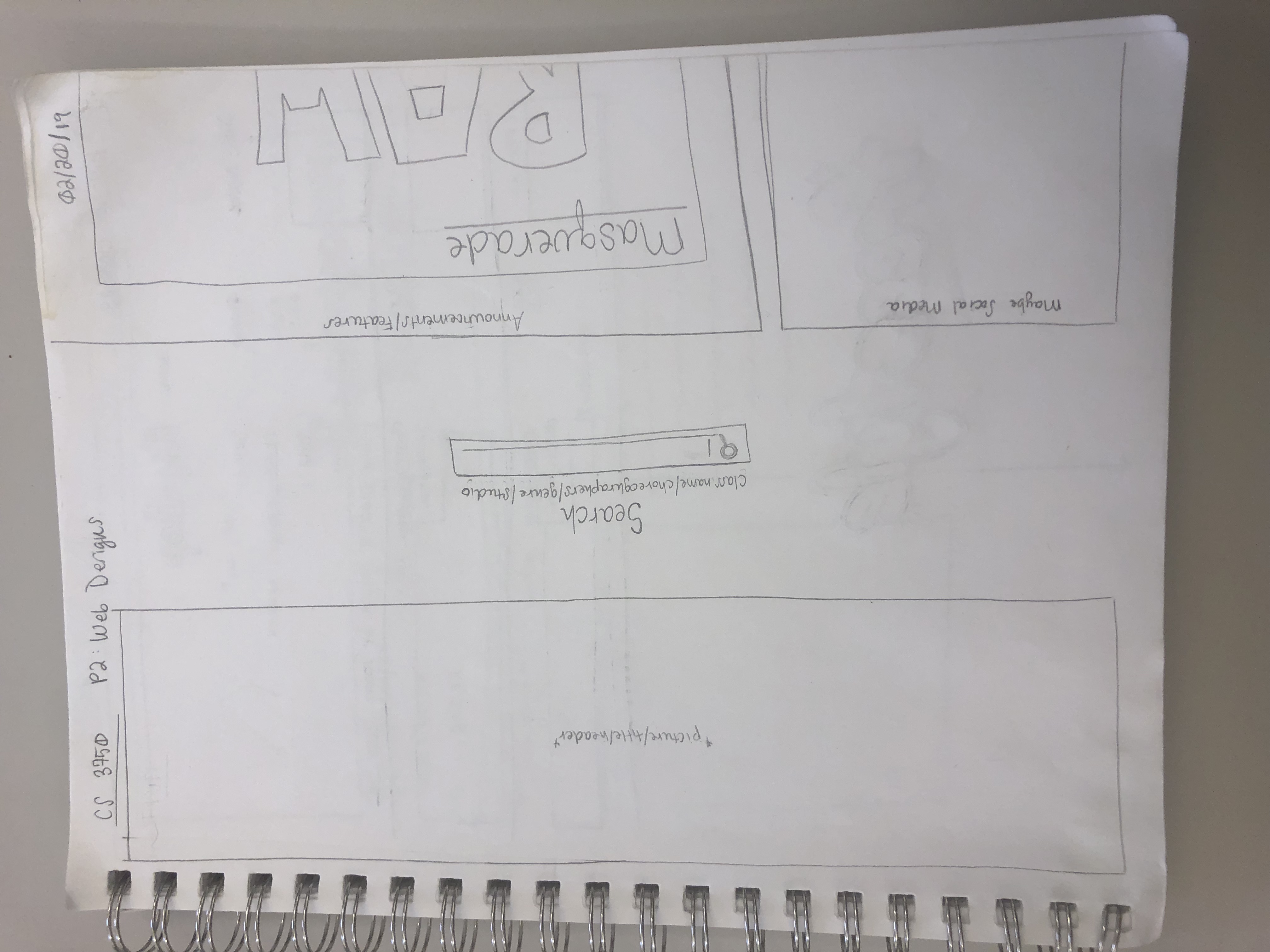
A common problem that independent dancers face is finding a studio and/or classes that satisfy both their training needs and interests. In our interface, dancers can view classes from a variety of local studios in one central location, so they can compare offerings and make choices that align with their individual preferences. The platform will allow them to access important details and registration pages for classes offered in their local area, so all they have to do after finding a class, is show up and dance.
Ideation Overview:
To start, our team brainstormed different technical solutions to the problem.
Option 1: Desktop Browser
Option 2: Mobile Application
Option 3: Email Newsletter
The main goal was to provide users with easy, on-the-go access to the local dance commuinty, so we narrowed our final design choice to the mobile application.
Key Features:
- icon dependent navigation
- calendar view for class information (for the current day)
- clear filtering options
The most critical design problem was screen real estate. Trying to fit multiple classes that occurred concurrently from a multitude of studios in a view with limited horizontal space became convoluted and messy. Originally, the idea was to have the ability to swipe left or right directly on the calendar to change dates. To showcase this ability, the left and right ends of the view would show parts of the previous and later dates. This also took up horizontal space on the calendar, furthering the problem. In order to remedy a part of this, the actual classes shown displayed only the very basic information, prompting the user to click on the item to receive a pop-up display that would show more specific details about the class.
Navigation Architecture:
The HTA (Hierarchical Task Analysis) Diagram below demomstrates the general navigation of a user through this process architechure of the application. This diagram shows the functionality of the app through various tasks that can be completed.
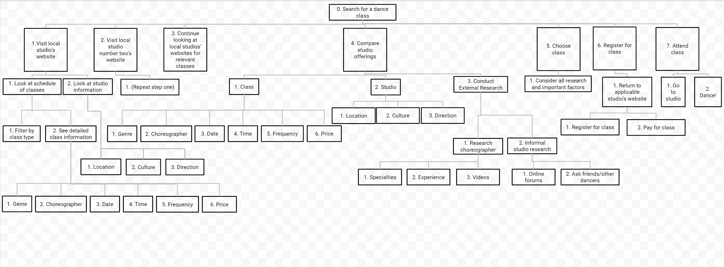
Our application focuses on steps 3 - 6 of the diagram - the process of determining what is offered by local studios, comparing the offers between studios, and chosing a class/program to register for. We want to enable users to identify the programs that are best suited for them in a quick and intuitive way. Specifically, making comparisons between different locations, schedules, and prices takes the longest amount of time in the current web-based process. The purpose of our application is to create a central location that will significantly decrease the amount of time it takes to choose and register for a class. Our main goal was to create a layout that accomplished this task in the most effective way.
Prototype Description:
Name & Logo Design:
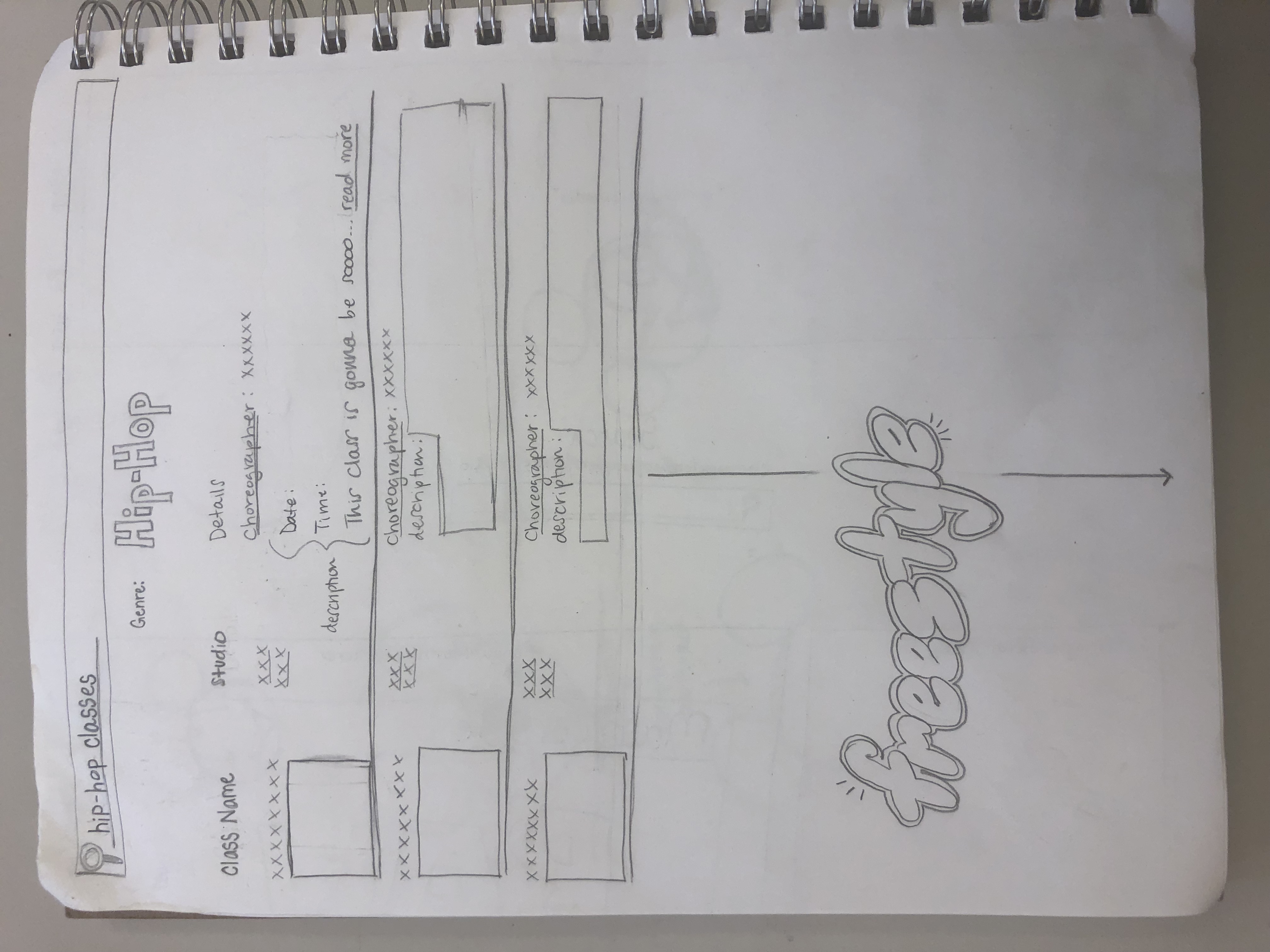
We decided on the name "FreeStyle" for our application because it not only made reference to free-style dancing, it also created a positive connotation for how users could utilize the app. They are "free" to explore any styles of dance that are available in their local area. The font and color for the logo was chosen to invoke a unique, rhythmic emothion within the user, complementary to the activites promoted by the app.
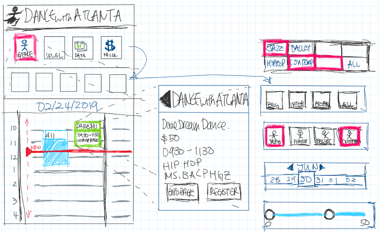
Our prototype focuses on navigating information within a calendar view, which we deemed to be the key functionality of the mobile interface, and what separates it from our other interface design considerations. We decided to present information in a daily view by placing available classes side by side, overlapping with their corresponding scheduled times.
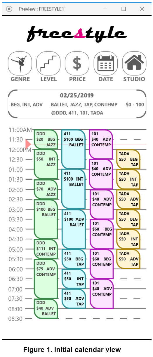
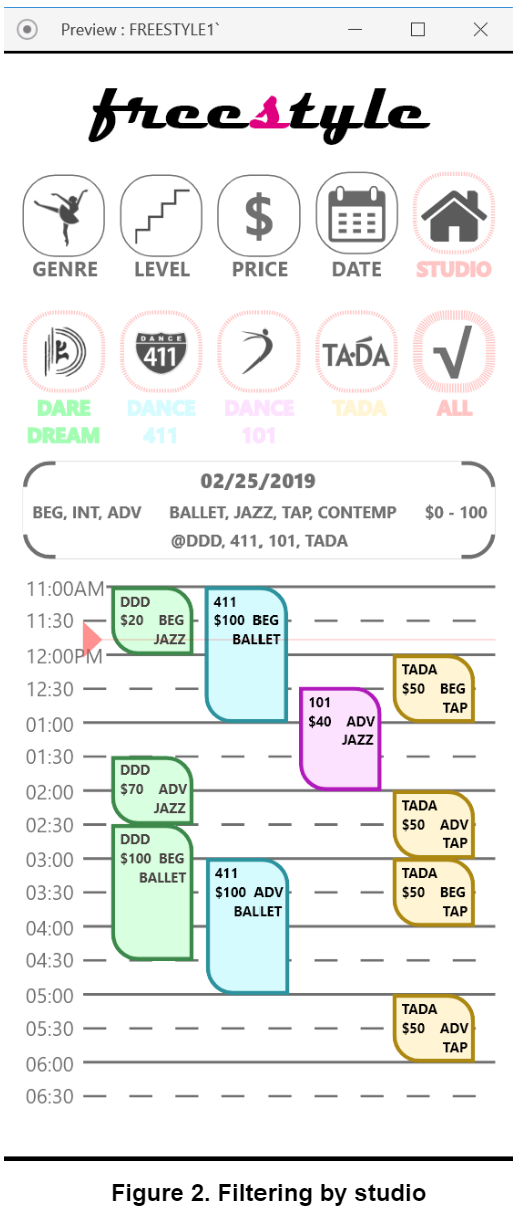
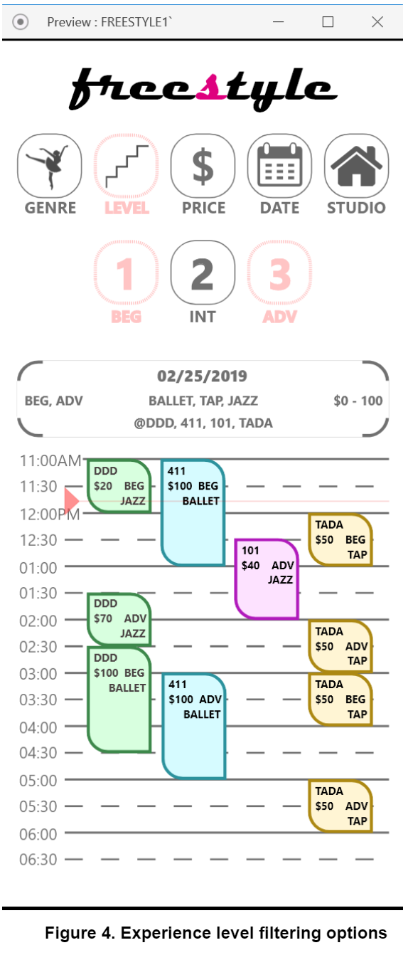
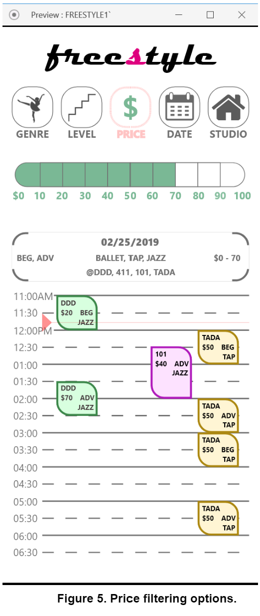
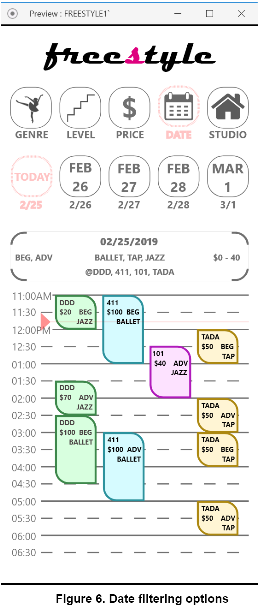
Associating each particular dance studio both with its own color and column in the calendar view allows users to parse the information quickly and accurately. This is further emphasized in Figure 2, which displays the text of the studio name in its corresponding color. The icons themselves were left in black-and-white in order to avoid interfering with the branding that may already exist for that studio. The initial home screen displays an unfiltered selection of all the classes offered for that particular day. Then, when a user selects a top-level filter option (genre, level, price, date, studio), the classes displayed will be narrowed down based on their selection.
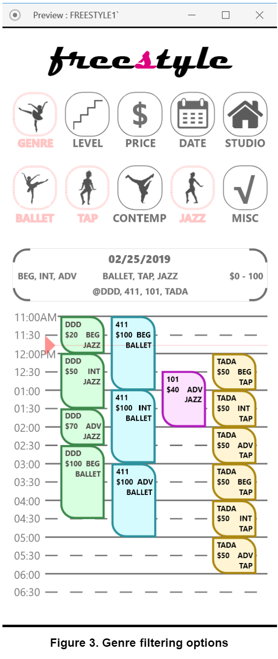
Additionally, figuring out how to display a summary of the active filters was a challenge. We had to find a way to differentiate it from the rest of the screen without occupying too much space. Surrounding the section with only whitespace proved problematic since the limited screen real estate didn’t allow enough space to separate it from the calendar and created confusing effects due to proximity. As a result, the rounded corners displayed above the calendar allows adequate whitespace while clearly grouping and separating the information from the rest of the screen demonstrating closure.
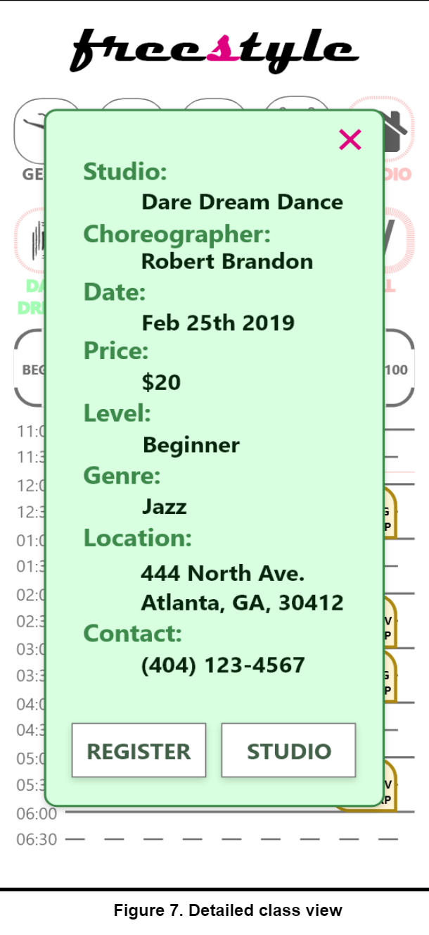
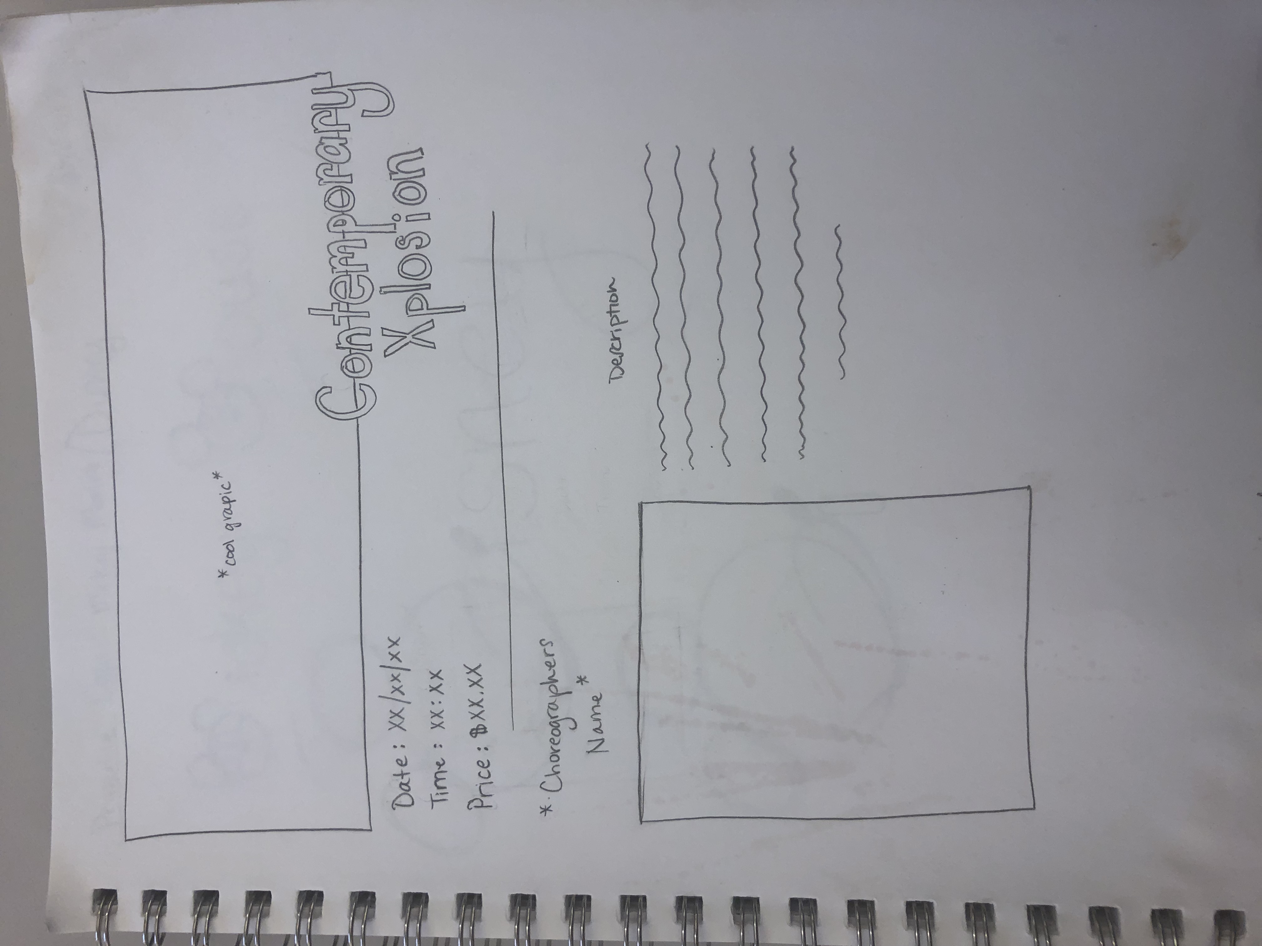
For a detailed view of a specific class that the user is interested in learning more about, we chose a popup window to display the information. This allows users to rapidly switch between detailed views of different classes, in the absence of enough screen space to display multiple detailed class options side-by-side. More importantly, this allows users to retain their filter options, as the user experience would be harmed if navigating to a different screen required a user to enter them again.
User Testing
Evaluation Techniques and Rationale
Techniques used:
- Think-aloud technique
- A/B testing.
The Think-aloud method gave us insight into the cognitive process of what the user was thinking when accomplishing their task. This was important and preferable compared to standard interview questions because some of the users had never searched for dance classes before, and none of the users had seen the application’s interface. Using a direct observation method was required for this particular task because the user was completing the task on a wireframe prototype, so a proctor was needed to make sure the user stayed focused on the relevant functionality of the application. A/B testing was used so that we could gather quantitative data on the tasks that the users performed. Having users use the website gave us insight on the current process for finding and registering for dance classes on existing platforms. Measuring the amount of time it took for a user to complete a task gave us comparable numbers to evaluate which method was faster.
Description of Tasks
Users were given a specific class type to register for, and then asked to find a class that fit the given criteria in the app and then on a web browser.
Task: Find a beginner tap class that costs $20 or less. (Required to be a future class for adults in the Metro Atlanta area)
The users were asked to complete the task while “thinking aloud” - talking through their actions and any pain points they were experiencing. They were also allowed to give up at any point. The task was considered complete when the user reached a registration page for a class that fit the given criteria.
Description of Users
We tested with 17 users, all from our target age demographic (18-35 years old). The users were recruited either through the local dance community of Atlanta, or through being friends with members of our team. I am a professional dancer, so she was able to test the people that I danced with. The group included 8 current dancers, 1 previous dancer, and 8 non-dancers with a gender distribution of men and women. Some of the users had first languages other than English, so this caused some additional difficulty with navigation.
Current dancers are the most likely users of the application, so the data from those tests presents a more accurate comparison of our app and the current process for finding dance classes. However, the non-dancers’ lack of familiarity with local studios and class offerings illustrated many of the difficulties and frustrations with the current process of finding a class. If this had been a real exercise for the non-dancers to register for their first dance class, many of them would have had a lot of difficulty and potentially even given up on the prospect of finding a class.
Results of Studies
Figure 1 shows the raw results of the user tests as a scatter plot. It plots the time that users took to complete the task with the app versus with a web search. It also distinguishes between experience levels with color (dancer, non-dancer, and prior dancer). Generally, non-dancers took the longest to complete both tasks, especially the web search task. App search time had much less variation than web search time.
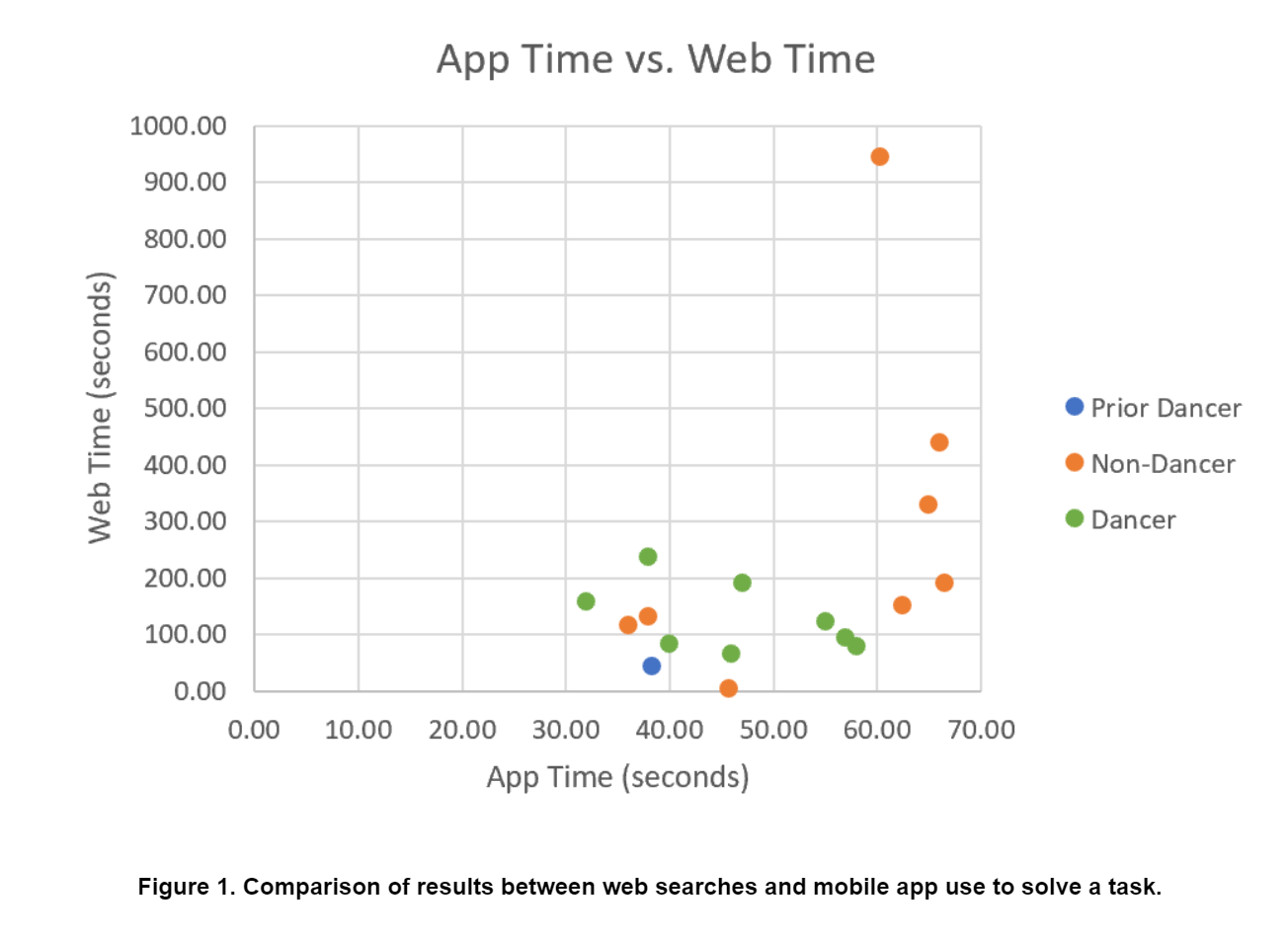
Figure 2 shows the raw results of user tests for the web search task in a box and whisker plot. The data is divided by user type (dancer, non-dancer, and all users), excluding the one prior dancer. Dancers had a significantly smaller range of times, and a shorter median time to complete the task. Even with two outliers removed, the non-dancers’ slower times skew the "Total Web" data.
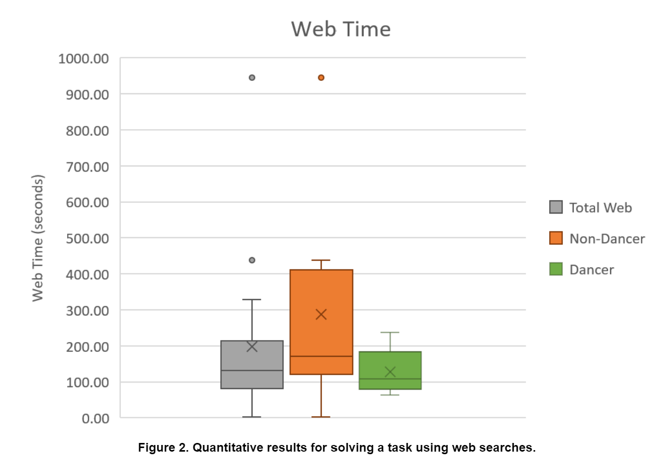
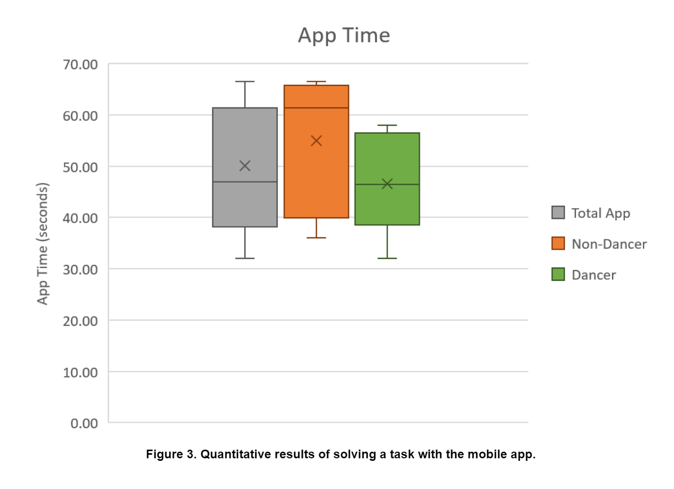
Figure 3 shows the raw results of user tests on our mobile application in a box and whisker plot. The data is divided by user type (dancer, non-dancer, and all users), excluding the one prior dancer. In the app, time for task completion did not vary nearly as much as it did for the web task for dancers or non-dancers. While non-dancers still had a larger range and a longer median time for overall task completeion, did not skew the overall data that much. The total median is very similar (slightly higher) than the median for dancers, and the total range is a little larger.
Implications of the Results with respect to Design
Our biggest challenge throughout this process revolved around limited screen real estate. We wanted to fit many different things onto one phone screen, which is difficult to do without overcrowding the screen or reducing text legibility. In the future, the design could be further improved by hiding some of the menu options to allow the schedule to occupy more of the screen. Furthermore, in our current design, the logo for each dance studio has been stripped of its original color. This gives the design a more uniform look, however, finding a way to keep the original logos for the studios would allow them to retain their brand fidelity.
A considerable source of confusion during app testing was with the view of class information as a calendar. The feature proved somewhat disorienting to users at first because having an app’s entry screen as a calendar is unfamiliar, aside from calendar applications. These users communicated that they expected and preferred to start the app with something like a search bar, and be presented a textual display of results. Those features were explored for the desktop version of the interface, and could be easily adapted to the mobile interface by adding a smooth transtion from a search view to a calendar view of results. This type of interaction isn’t unheard of with mobile interfaces. One great example is the mobile interface for Google Maps, which displays a map with an overlay of a search bar and searchable locations. From our discussions with our test users, these sorts of elements are what they would have liked to see in our prototype.
More generally, users found the color coding of the classes on the calendar to be unclear, and would have liked to have seen something like a legend. Specifically, the suggestions of the non-dancers tended to focus on usability and background information. For example, an introductory tutorial guiding users through the use of the app, or short example videos demonstrating the different styles and genres for those new to dance. These users tended towards features that may exceed the intended focus of the app, towards a complete one-stop resource to learn all about dance.
Overall, users exhibited positive responses to the design and functionality of the application, and they encouraged its continued development with suggested improvements. It wwas clear that this app has the potential to be developed into a fully functional application. Even with its flaws, it was preferred over using the web search method. It not only decreased the average amount of time it took to find and register for a dance class by 75%, it created the foundation for a centralized location where users were able to accesss and interact with the local dance community.